
 |
| Suh Jaehyun Student Reporter Andrews Osborne Academy 12th |
PANTONE, the color industry leader that is headquartered in the USA, chose ‘Living Coral’ for the color of the year for 2019.
‘Living Coral’ (PANTONE Coloration Number 16-1546) is a combination of light orange with little gold and pink. It seems like the pulp of grapefruit. It has both energetic and placid characteristics.
It is inspired from the real coral. It gives the warm and bright feelings to those who see it.
Living Coral can be found easily in nature. It gives people the power of vitality. Also, Living Coral has a meaning of environmental protection. One of the reasons Pantone selected this color is that coral reefs play an important role in the ocean ecosystem. For example, coral reefs are the home for many different types of organisms in the ocean. Also, coral reefs provide nutrients to other organisms.
Each year since 2000, PANTONE has selected ‘the color of the year’ to provide the guidance of the color trend to various industries for the following year. This helps people find the unrepresented colors or various cultures, entertainments, movies, arts, and fashions from all over the world.
PANTONE says, “We chose Living Coral as the color of the year for 2019 because it has the meaning of vigor and vitality. Also, it is the home for many other organisms in the ocean”
팬톤이 선정한 2019년 팬톤 컬러 '리빙 코랄'(Living Coral)’
미국의 세계적인 색채 연구소이자 색상회사인 팬톤은 매년 트렌드 컬러를 선정하는데 2019 올해의 색으로 '리빙 코랄(Living Coral)'을 선정했다.
올해의 색으로 선정된 '리빙 코랄'은 살아있는 산호에서 영감을 받아 탄생한 색으로, 따뜻하면서 경쾌한 느낌을 가지고 있어 모든 분야의 붐을 일으킬 정도로 매력적인 색감을 자랑하고 있다.
리빙 코랄(팬톤 색상 번호 16-1546)은 황금빛을 띄는 밝은 오렌지에 핑크를 더한 컬러다. 잘 익은 자몽의 과육을 연상시키며, 오렌지색의 통통 튀는 에너지와 핑크의 온화함을 동시에 갖춘 매력적인 색. 바닷속 산호초에서 영감을 받은 색이다.
리빙 코랄은 살아있는 자연에서 발견되는 친숙한 색인 동시에, 사람들에게 활력을 주는 힘과 소셜미디어에서도 활발히 쓰이는 색으로 교류와 관계를 의미하기도 한다.
또한 리빙 코랄이 자연 보호의 의미도 담고 있다. 직접적으로 영감을 준 소재는 산호초로, 이는 해양 생태계에서 중요한 역할을 하는 생물의 서식지가 되기도 하고 때로는 먹이도 되는 산호의 생명력을 떠올리게 해 2019 올해의 색으로 선정된 이유 중 하나이다.
팬톤은 매우 신중한 트렌드의 분석을 통해 2000년부터 매년 12월 '올해의 색' 선정해 이듬해의 컬러 트렌드를 제시해 왔다.
패톤은 매년 새로운 색상을 찾기 위해, 세계각국의 다양한 문화와 엔터테인먼트 산업, 영화, 여행, 예술 산업과 새로운 아티스트, 패션, 모든 디자인 분야뿐만 아니라, 사람들 사이에 유행하는 새로운 라이프 스타일 및 사회 경제적 조건을 분석한다.
지난 20년 동안 팬톤의 '올해의 색'은 패션, 가정용 가구 및 산업 디자인은 물론 제품, 포장 및 그래픽 디자인을 비롯한 여러 산업에서 제품 개발 및 구매 의사 결정에 영향을 미쳐왔다.
팬톤 관계자는 2019년의 색으로 단순한 코랄 컬러가 아닌, '리빙' 코랄을 택한 이유에 대해 "'리빙'은 생명력, 활기의 의미를 담고 있다"며 "산호는 해양 생태계에서 생물들의 서식지가 되기도 하고 먹이도 되는 존재이기 때문에 그러한 지속 가능성과 생명력을 전하고 싶었다"고 밝혔다.
Suh Jaehyun Student Reporter gnpost@naver.com
<저작권자 © 강남포스트, 무단 전재 및 재배포 금지>
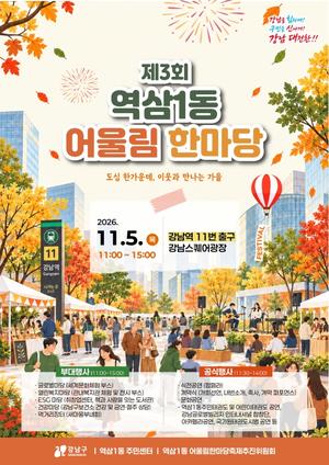 ‘제3회 역삼1동 어울림 한마당 축제’


